Power Query Optimization: Essential Tips for Better PerformanceDespite the availability of various enterprise-grade ETL tools in the market, Power Query and Dataflows remain the transformation tools of…Nov 17, 2024Nov 17, 2024
How to make data visualizations (or any design) more accessible?Tips on how to make data visualization or design accessible for people with color deficiency (color blind)Apr 24, 2022Apr 24, 2022
Bahrain 2021 Grand Prix — A Quick Analysis of Max Verstappen and Lewis Hamilton’s RivalryWhy 2021 Formula 1 season could be one of the most exciting seasons in recent years?Apr 10, 2021Apr 10, 2021
How I keep my dataset updated using Azure Data Factory and Blob StorageRecently, I was working on a reporting dashboard visualizing Toronto’s COVID-19 data. The dataset in use is from Toronto’s Open Data which…Jan 3, 2021Jan 3, 2021
Formula 1 Comprehensive dashboard — Part I: Creating a SQL databaseThis tutorial has also published on my personal website.Sep 29, 2020Sep 29, 2020
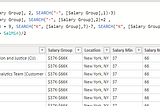
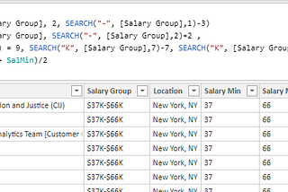
Data cleaning in DAX: Splitting text stringsThis tutorial is also published on my personal website.Sep 27, 2020Sep 27, 2020
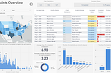
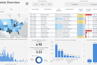
Creating a business intelligence dashboard with Microsoft Power BIHow to create a business intelligence dashboard using Microsoft Power BI. Visualizing complaints data for an insurance company in the US.Sep 8, 2020Sep 8, 2020
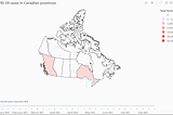
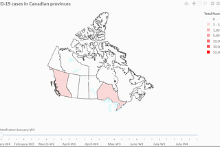
Animated choropleth map with discrete colors using Python and Plotly + StylingHow to create an animated choropleth map with discrete colors using Python and Plotly. Visualizing COVID-19 data in Canadian provincesSep 2, 2020Sep 2, 2020